
There’s nothing like a snowy winter morning with frigid temperatures that keeps you ensconced in your warm, cozy house with a hot cup of java.
There’s nowhere to go and nothing to do (well, except watch the the Ravens suffer a pathetically fumbly loss to the Bills last night in frigid temperatures…)
Yes, boring can be GOOD.
The same — shockingly enough — can be true when it comes to your sales copy.
It all depends on your positioning and branding, the audience you’re speaking to, and your relationship with that audience.
I’ve got two examples of BORING copy which is being used effectively that I’m going to share with you today.
They’re both short and sweet — which is how I’m going to keep things today in this email. (Be sure you don’t miss the P.S. at the end… I’ve got an exciting announcement for you.)
Let’s look at BORING copy example #1. This beauty of a 6×9 postcard showed up in my mailbox not long ago.
It’s from a skin care company I ordered a few products from over a year ago, and nothing since (I actually returned one of them).
Let’s take a look at the front (where the address goes — it’s typically the first side of a postcard someone looks at)…
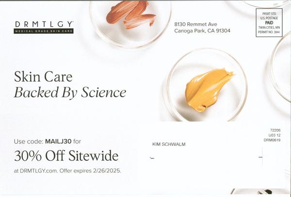
The design is clean and eye-catching — and the copy? Minimal.
In fact, someone could write the copy for this postcard in a fraction of the time it takes to fashion an AI prompt.
That headline? As a copywriter, I want so hard to change it… add a benefit… news, curiosity, a shred of uniqueness… something!
But it’s basically a shorter, tighter version of the brand positioning that’s clearly communicated on the company’s website as well as ads (generic as it may be).
And this is a postcard that’s going to past buyers — maybe it’s their entire buyer list, or maybe it’s just targeting lapsed buyers like me with the goal of reactivating them. I’m not privy to that info.
Yet there’s another, more important reason to not overdo the copy here NOR the graphics (i.e., adding a beautiful woman’s face up close to show the end result)…
It’s because you don’t want anything to take away from that strong offer! Yes, that 30% off discount needs to take center stage here.
It’s very clearly communicated (unlike so many offline-to-online promos I’ve seen in recent years). It tells you exactly where to go and tells you the deadline.
Keep It Simple, Stupid (KISS)! Let’s take a look at the other side of the postcard…
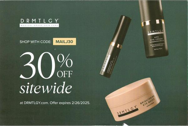
Now we see that savings offer really get the spotlight, with the special coupon code featured and the same website address and deadline clearly stated.
Those product pictures are probably showing some of their top-selling products. And if you go to their website, you can see that the design and branding are all consistent.
This is such a simple promotional piece to create. Yet it’s always amazed me that so many companies with consumable products like skin care and supplements don’t regularly do highly-profitable “low-hanging fruit” promotions like these.
Direct mail postcards are cost-effective and easy to put aside on your desk or bedside table to take action on later — unlike an email or ad that’s easily forgotten.
Great example of how easy it is to use boring copy and branding to keep customers buying from you.
Now let’s go to the second “boring” copy example I want to share with you. It’s actually a relatively new re-branding for a bank.
When visiting one of its local branches recently, there were posters like this one that caught my eye and attention…
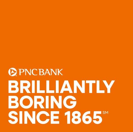
This is great branding for a bank, since people want “boring”, i.e., stability and safety, when it comes to their money. This tagline also provides proof by citing the fact that they’ve been a bank for well over a century.
Yet it keeps everything short and sweet — and graphically interesting with the orange background.
Last year PNC launched this new branding as part of a broader campaign, including social media. I found this article about it here if you’re interested.
You might also want to check out their website to see how they’ve integrated their new branding brilliantly to mesh with their copy and product positioning.
Here’s a quick peek…
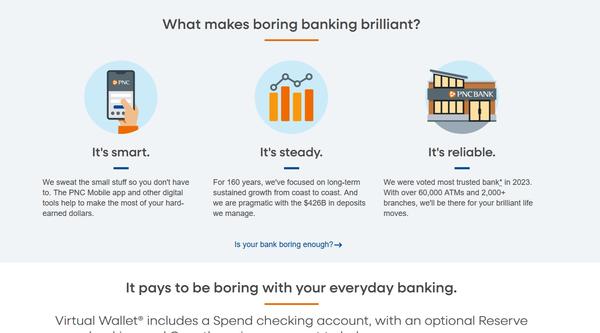
This home page copy brilliantly emphasizes all the “boring” things you want in your bank, challenges someone to consider switching from their current bank, and makes a smooth transition to talking about their bank account options.
It reminds me how powerful it can be to take a perceived disadvantage of your product or service and turn it into a major advantage. Boring is a huge positive here.
Hopefully these two examples gave you some ideas to work with, whether it’s reactivating lapsed customers, using direct mail to generate back-end sales, or standing out from a slew of nearly-identical competitors.
Like reading longer content like this? I’m considering another option besides lengthy emails: Substack.
If I started a Copy Insiders Substack, is it something you’d sign up for? Let me know if that’s a quick “yes” or “no” here.
And DON’T miss the P.S. for a special announcement!
Yours for smarter marketing,
Kim
P.S. The world’s greatest living copywriter — Gary Bencivenga (who’s also a Copy Insider) — just started sharing his brilliance in a free e-letter.
You can sign up here to get his Marketing Maxims. They’re sure to give you incredibly valuable insights!
(That’s Gary and I from a dinner in NYC a few years back… click the pic to sign up for his e-letter now!)