Food is one of the essential needs of human life.
But so many of us struggle with the eternal question that haunts us day after day: “What’s for dinner?”
As a result, a slew of done-for-you meal services have sprung out of nowhere in recent years… and they’ve enjoyed spectacular growth, particularly during Covid.
Now, the field is saturated with competitors.
I should know, I’ve tried many of them:
- ones that provide a completely-made meal that you just zap in the microwave…
- ones that come as a kit, requiring you to assemble and even cut up ingredients, and then cook on your stove…
- and others with everything already chopped up into tiny little containers that you then pour out into your pan or mixing bowl like a mad scientist.
So with so much competition, how do you stand out if you’re in the “meal solution” business these days?
How do you make your solution — and your big promise — more believable to your prospect that it will actually deliver, in a superior way, the desired benefits?
(The main benefit being this: better-tasting food in less time with less effort.)
The answer, my friend, is to look at Gene Schwartz’s stages of market sophistication.
In the first stage, you simply had to say, “hey, done-for-you meals over here… come and get them!”
In the second stage, you simply said, “our done-for-you meals take just minutes of prep” or “our done-for-you meals taste better because we use actual chefs”.
But now, we’ve entered the third stage of market sophistication for this niche. The jaded done-for-you meal prospect (I’m one of them) has already tried multiple solutions that made the same or similar promises before you.
And for whatever reason, they found the solutions lacking. Perhaps there were more steps involved than they wanted to deal with… they didn’t like all the excess, throwaway packaging… or they simply didn’t find the meals all that appetizing.
So now the market is thirsting for a new mechanism. As Gene Schwartz puts it in his book Breakthrough Advertising:
“…a new way to making the old promise work. A different process–a fresh chance–a brand-new possibility of success where only disappointment has resulted before.”
Enter the 4-color, multi-panel direct mail self-mailer promotion I got in my mailbox last Thursday. Here it is taking over my desk…
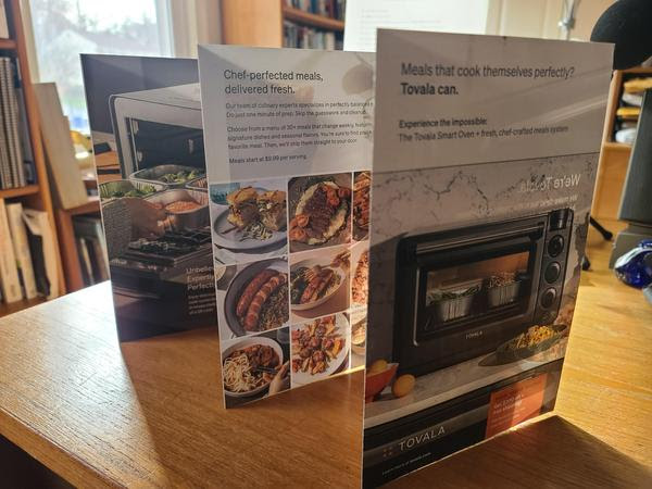
When I first came across this mailer, I flipped it over to look at the front panel. And I found it a bit confusing. Was it selling me an oven, or done-for-you meals?
Clearly if I’d read the copy more closely, it would have been obvious it was a combination of the two.
But I immediately assumed it was only the latter: yet another done-for-you meal subscription service, since I often get those types of offers in the mail.
Take a look at the front panel: what is your immediate, at-a-glance reaction?
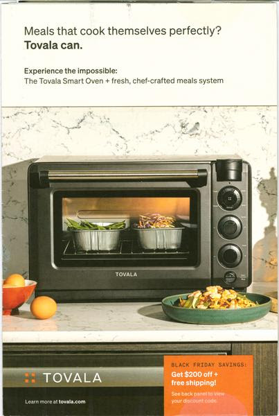
Chances are you had the same reaction I had. Or maybe you thought it was only selling you a new oven. That’s why graphics often matter as much or more than copy when going with a more visual medium like this.
So the one suggestion I have for this front panel is to put more emphasis on the food and less on the oven to better showcase what they’re selling. If they’re going to people who want easier, better-tasting meal solutions (and not yet another countertop appliance), show them that.
The orange call-out in the bottom right announces a Black Friday special and directs the prospect to the back panel. So let’s go there next and take a look…
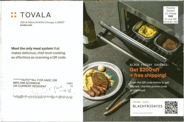
Ah, now (if you read the copy) we’re hearing about the new mechanism they’re offering to stand out from the competition: cooking your dinner like a chef by simply scanning a QR code.
Heck, we’ve all gotten pretty used to scanning QR codes–even the senior citizen crowd, thanks to many restaurants permanently adopting them in lieu of menus after their Covid era popularity.
They’ve even got a Black Friday promo code we can use to practice our QR scanning skills!
My only suggestion here is to clarify what they’re saving $200 on. Is it the oven? The meals? Also, $200 signals that this is an expensive solution. Would it be better to say “Get started for as little as $49”? (I’ll share the offer panel with you in a moment.)
There are several inside panels with pictures of gourmet-looking meals, with various testimonials and media endorsements throughout to build trust and credibility. But let’s take a look at these two panels that explain the solution:
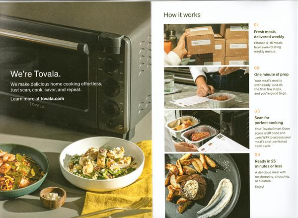
I’m liking the photo on the left, and think it might work better on the front panel than the one that’s there now. It shows two different meals (a likely scenario for couples) as well as a small dish signifying the small amount of prep needed.
On the right, it clearly explains how it works. Except I take issue with the word “it”. Say “How Tovala works”. Keep that brand name in front of the prospect.
I would add a few more words of copy to the steps listed to add more appeal, while keeping it short. For the first one (having gone to their website), hint at the range of options for different diet preferences: “Choose from over 30 new, chef-crafted meals each week, including carb-conscious and calorie-smart options.”
The second might want to clarify a bit more what that one minute of prep might be so it doesn’t raise a possible objection (people don’t want to have to chop things up, for example).
The third might want to add a line that explains why the Smart Oven does it better than their own oven or microwave, i.e., the fact that by doing so it consistently delivers a perfectly-cooked meal every time, with no guesswork.
And the fourth step might want to put in whatever the lower end of that prep time range is, since 25 minutes sounds like a long time when someone’s put off thinking about dinner until the last minute and they’re “hangry”.
One other thing. I normally think it’s a bad idea for direct mail promos to send prospects to a website, because so often it’s not done in a seamless and congruent way that leads prospects to the same offer they got in the mail.
But in this case, Tovala does it right. You can check it out here. The way the page is set up, it’s a seamless transition to the same Black Friday offer, but allows the prospect to easily get questions answered and objections overcome quickly.
Let’s wrap this up by looking at the all-important offer page, or in this case the offer panel:
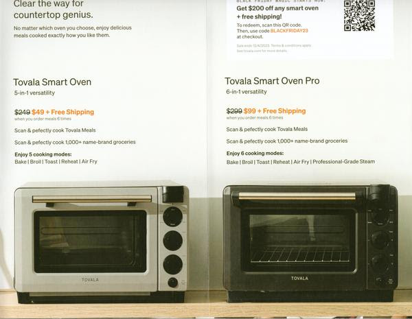
At the top near the call-to-action headline, I’d add another line that emphasizes the convenience and, especially, the unique mechanism they’re offering.
I’m not sure they’ve convinced me in this promo why I need to have yet another countertop appliance when, like most of their prospects, I already have an oven, a microwave, and a toaster oven taking up space in my kitchen.
It’s a real challenge, because they’re attempting to bundle and sell two completely different products in one offer: great-tasting, convenient-to-prepare meals AND a superior device for cooking them in.
One other thing: If I were considering buying, I’d find myself in a quandary at this point trying to decide between the two different options. I’d be wondering if I need the “professional-grade steam” option offered by Tovala Smart Oven Pro to prepare the chef-created meals.
It leaves me feeling indecisive. And indecision is the death of taking action.
There’s also no guarantee that removes the risk of ordering. All there is is some faint tiny type near the QR code in the upper right that reads ominously, “Terms & conditions apply.” Not reassuring.
Overall, this promo gets high marks for finding a way to stand out from its competition, and for making me look at it due to its nice-looking photography and inviting multi-panel self-mailer format.
But it needs to find a way to more clearly communicate the advantages of its unique mechanism as well as make the offer feel more inviting and risk-free.
Obviously these are lessons you can and should apply to any type of sales promotion you write–online or offline. The ones that have been standing out more to me lately are the ones showing up in my mailbox.
If you’ve got an online (or offline) promo you’ve seen “out in the wild” that you think is good — or that you think needs some help from “Dr. Kim” — please send it on over to me at Kim@kimschwalm.com. I may do a breakdown of it in a future issue of “What’s in Kim’s Mailbox”.
Yours for smarter marketing,
Kim
P.S. Speaking of bundling products together, this whole week is going to be one big “Bundle-palooza”. That’s because I’ll be offering a money-saving bundle of my very best copywriting training for Copy Insiders ONLY through Black Friday.
Plus I’m taking part in a big bundle of copywriting training from multiple top copywriters and marketers at a ridiculously low price. I’ll have more details for you tomorrow.
But if you want to get deep into A-list-level copywriting with yours truly as your teacher and virtual mentor, my Get Dangerously Good Copywriting Bundle is the deal of the year. (You can get a jumpstart on it here.)